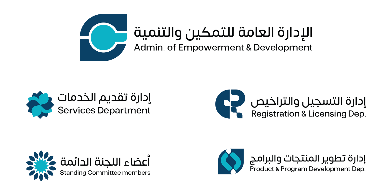
Social Development Bank — Visual Identity System
One of Saudi Arabia's most prominent government banks needed a complete visual identity system for its sub-departments — not just a logo, but a unified design language. The challenge: create individual logos for each department that feel independent yet connected to the parent brand. The solution: a single design element - the dot of the Arabic letter "Taa" - used as the visual foundation for every department logo. Each department gets its own interpretation of this element, creating a family of marks that are distinct yet unmistakably connected. Departments included: ✦ Admin. of Empowerment & Development ✦ Registration & Licensing Department ✦ Services Department ✦ Product & Program Development Department ✦ Standing Committee Members Each icon carries a deeper meaning: — Registration: the R letter merged with the Taa dot — Services: the dot becomes a gear/flower — "services delivered with love" — Development: coding brackets inside the dot — technology-driven growth — Committee: 14 petals for 14 members — light and guidance Deliverables: ✦ Complete visual identity system ✦ 5 department logos — Arabic + English ✦ Color system — Navy + Teal ✦ Print-ready files

International Community School - Brand Identity
ICS is a startup school in Cairo that needed a complete brand identity reflecting learning, community, and protection. The challenge: design a bilingual identity (Arabic + English) that feels both academic and welcoming. The solution: a logo combining two symbols — an open book representing knowledge, and a shield representing a protected community. Gold and silver colors were chosen to reflect royalty and development. Deliverables: ✦ Logo design — Arabic + English ✦ Signage system ✦ Color palette — Gold & Silver ✦ Print-ready files
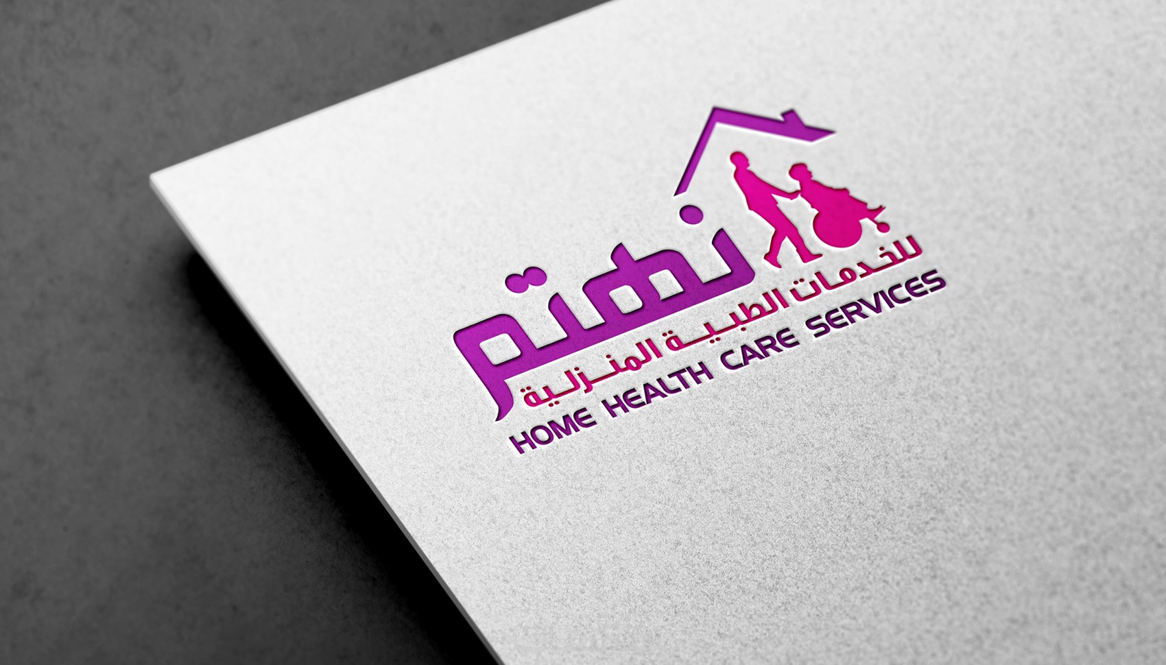
Nahtam - Home Health Care Services
Nahtam is a home healthcare services company that needed a warm yet professional brand identity inspiring trust and care. The challenge: design a bilingual identity (Arabic + English) that feels both medical and human. The solution: a logo combining care and movement — soft colors communicating compassion, with clean Arabic typography that feels approachable and trustworthy. Deliverables: ✦ Logo design — Arabic + English ✦ Color system ✦ Typography guide ✦ Print-ready files
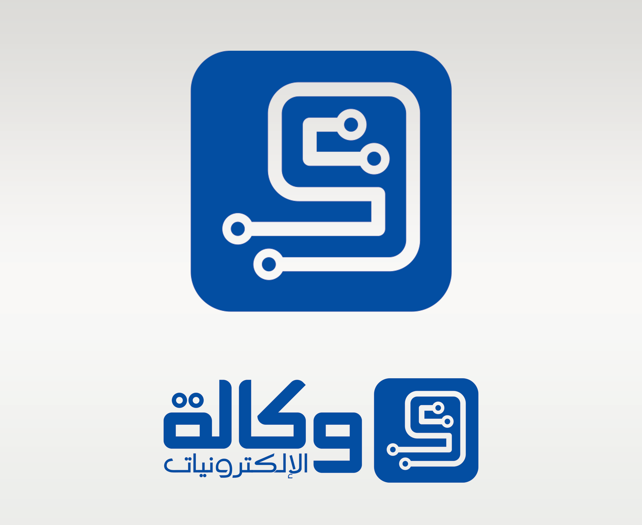
Wekalat Al Electronics - Brand Identity
An electronics agency needed a modern Arabic identity communicating technology and trust. The solution: Arabic typography integrated with a circuit board icon — bridging traditional language with modern technology. Deliverables: ✦ Logo + App Icon ✦ Arabic typography ✦ Print-ready files
NABD - The Pulse of Sports
NABD is a sports platform that needed a brand identity capturing the energy of competition and the heartbeat of sports. The challenge: create a bilingual identity (Arabic + English) that communicates the brand name visually before you even read it. The solution: a logo combining a heartbeat pulse with an athlete in motion — the word "NABD" means pulse in Arabic, and the icon tells that story instantly. Deliverables: ✦ Logo design — Arabic + English ✦ Color system ✦ Typography guide ✦ Print-ready files
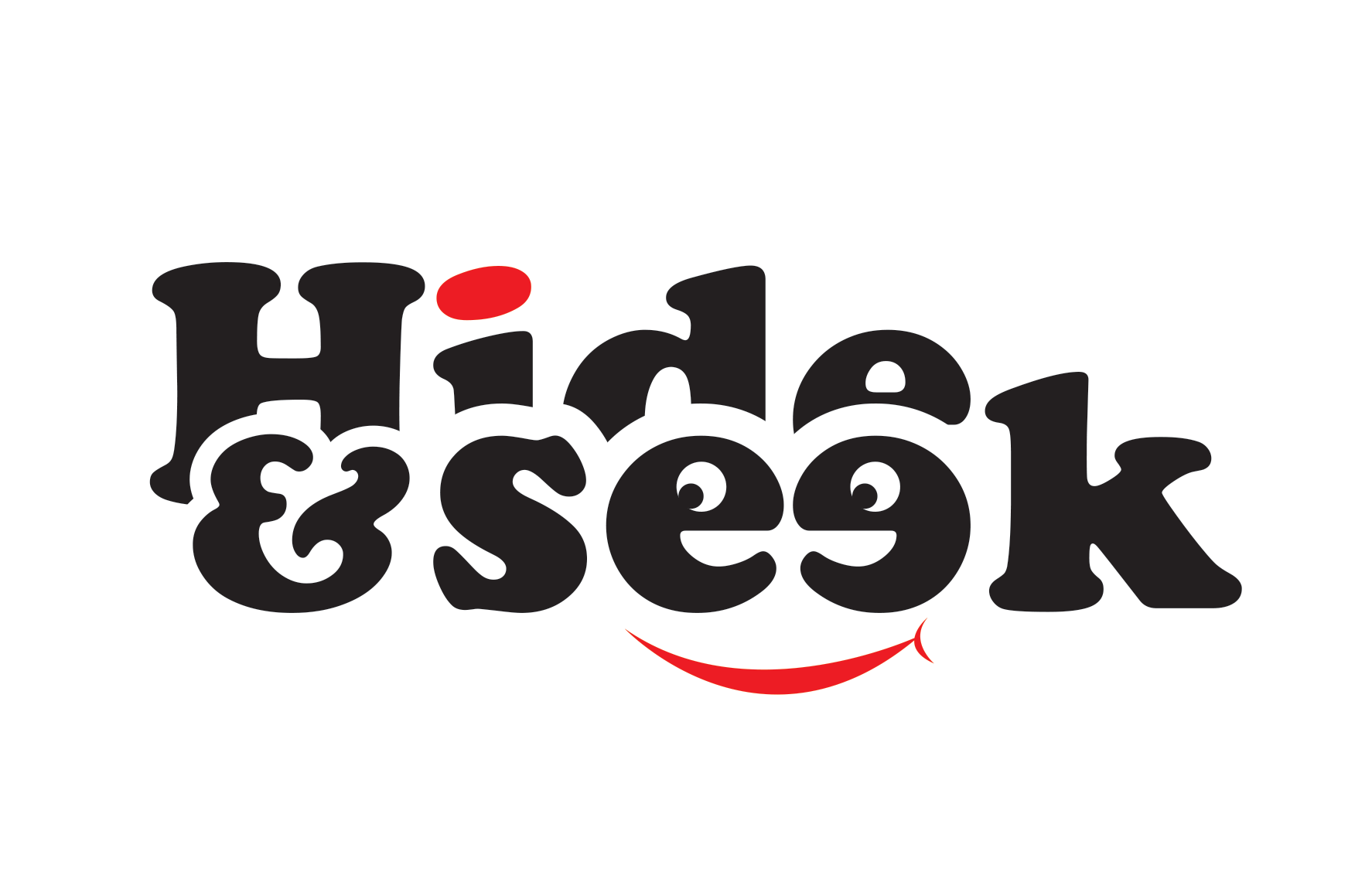
Hide & Seek - Playful Brand Identity
Title: Hide & Seek — Playful Brand Identity A fun, bold logo with personality — the typography itself tells the story, with hidden faces and a smile built into the letterforms. A demonstration of creative typography and character-driven brand design. Deliverables: ✦ Logo design — English ✦ Custom typography ✦ Print-ready files
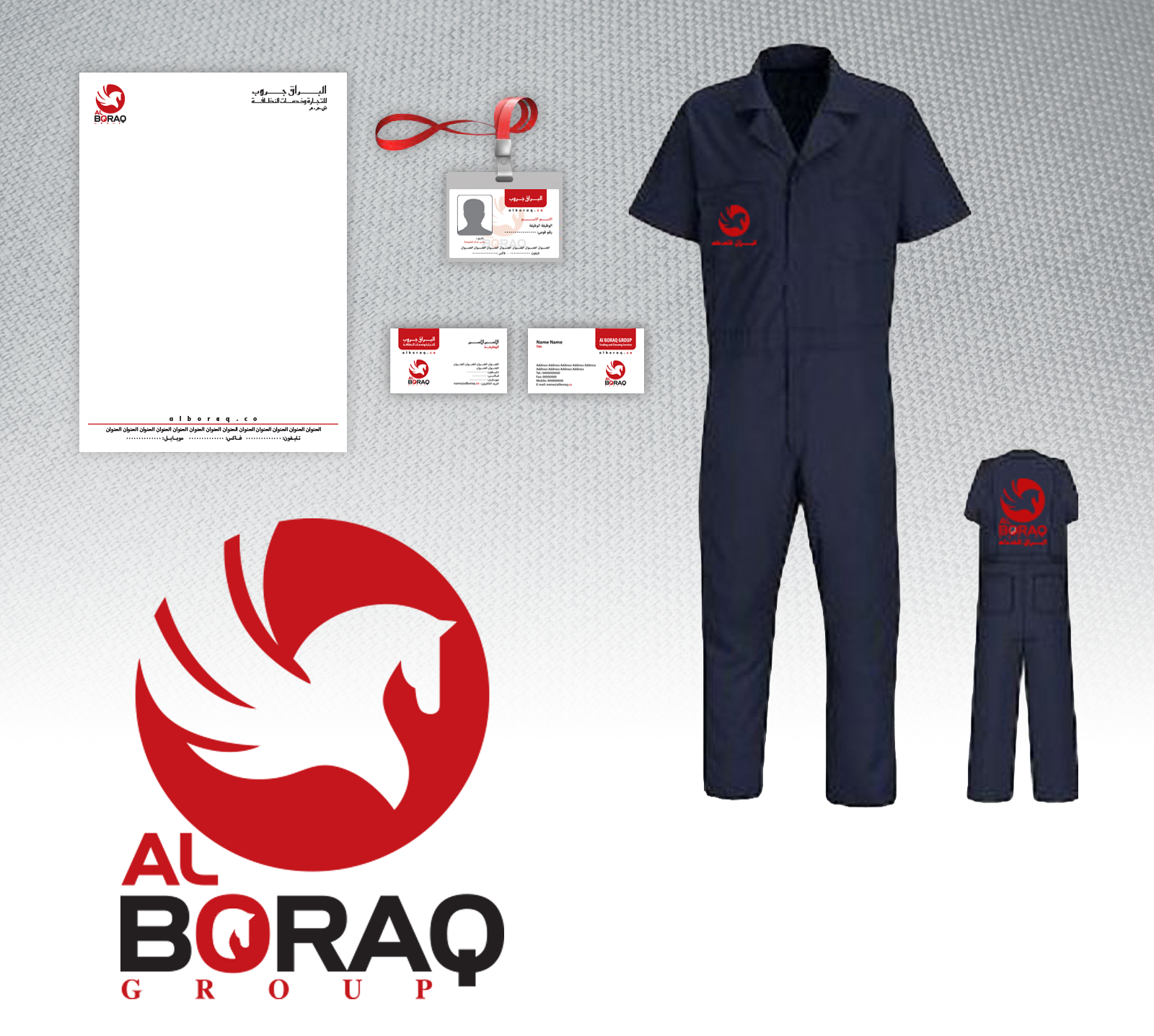
Al Boraq Group - Brand Identity
Al Boraq Group is a trading and services company that needed a strong, bold identity reflecting power and prestige. The challenge: design a bilingual logo (Arabic + English) that feels corporate yet distinctive. The solution: a dynamic eagle icon combined with clean, strong typography — communicating strength and reliability across all brand touchpoints. Deliverables: ✦ Logo design — Arabic + English ✦ Color system ✦ Print-ready files
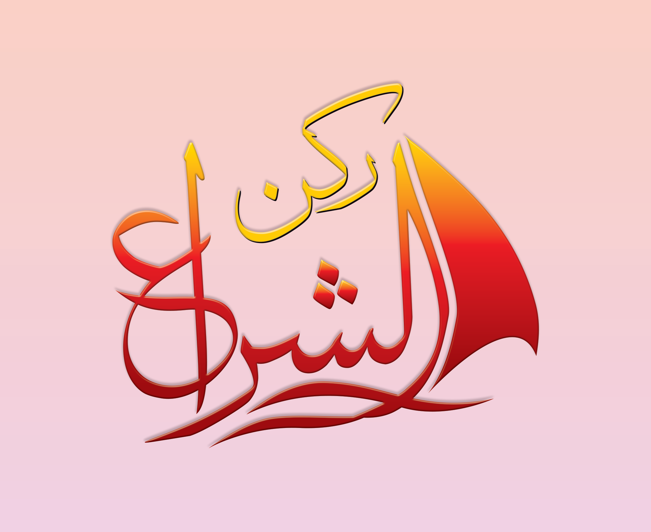
Rekn Al Sheraa - Arabic Calligraphy Logo
A brand identity built entirely around Arabic calligraphy — one of the most challenging and rare skills in design. The logo combines traditional Arabic script with a sail symbol, creating a flowing, dynamic mark that feels both classic and contemporary. Deliverables: ✦ Arabic calligraphy logo design ✦ Color system — Gold & Red ✦ Print-ready files